Right now, I have three versions of the same landing page sitting side by side. Same brand, same wordmark I have been using since the days when GAIA was a Flash framework. They do not look like they came from the same place. The first reads like a competent first draft. The second looks like a product I would pay for. The third reads like a designer and copy editor argued over every line until it was right. The most interesting part is that the same model produced all three: Opus 4.7.
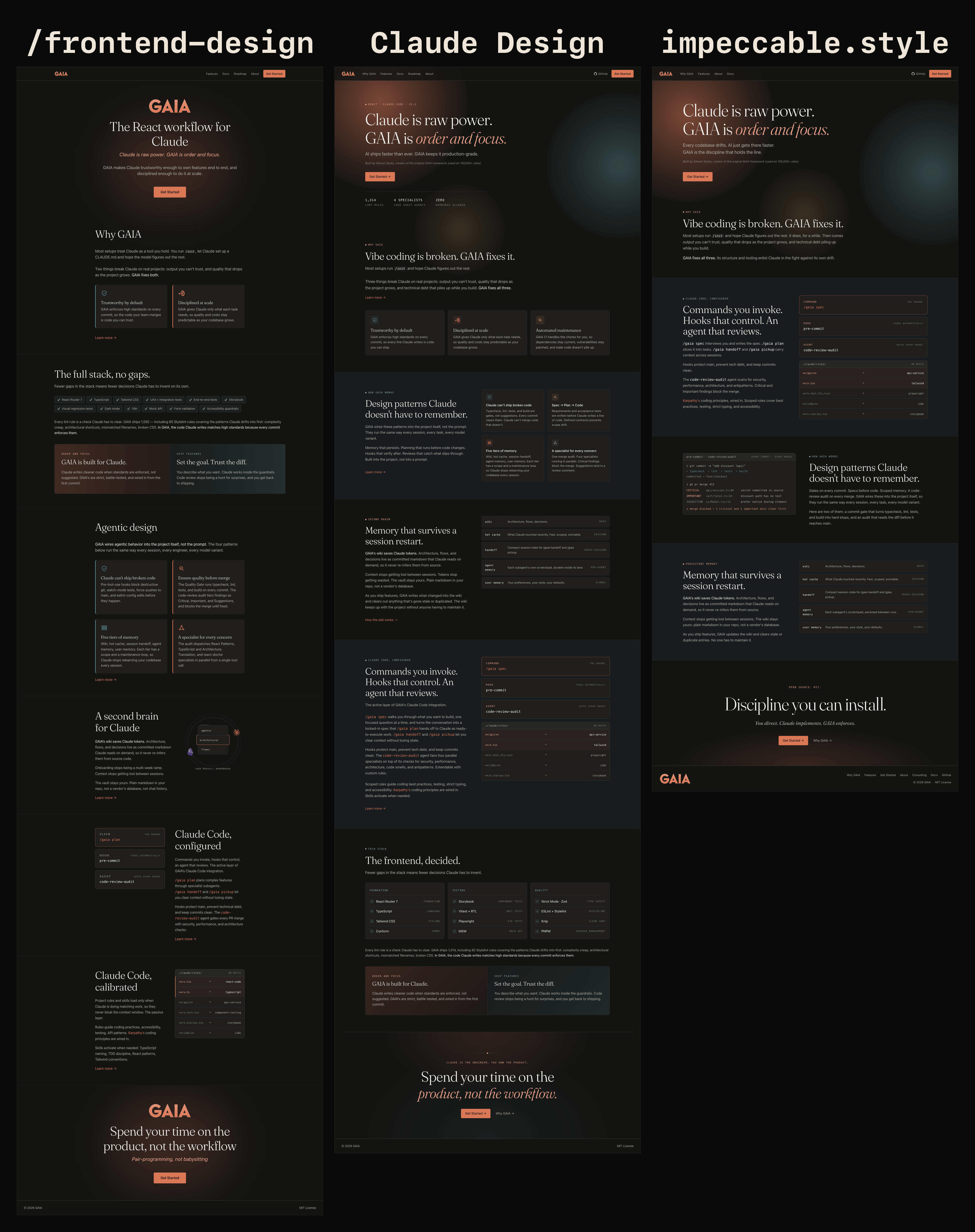
I did not set out to run a bake-off. Each tool walked into the project as I found out it existed, one after another, and by the end I had an accidental experiment on my hands.
One caveat up front. I am not a graphic designer. I think I have a decent eye for what looks right, but I do not have the training or the vocabulary, and I suspect that describes a lot of people reaching for these tools. A real designer would almost certainly get better work out of all three than I did, the same way an experienced engineer gets better code out of Claude than a non-engineer would. The tool raises the floor. The person still sets the ceiling.
Version 1: /frontend-design skill
The /frontend-design skill was the first AI design tool I knew about. It runs inside Claude Code, so I gave Claude the GAIA codebase, the README, and a rough outline of what the site needed to say.
I asked it to propose a color palette and some examples. It generated three options and rendered each one live with the Playwright CLI, so I could see them side by side. I picked burnt orange and teal. I gave it my GAIA wordmark and it recolored it to match. It produced a sample design system. I kept a handful of the elements, and it built the rest of the page around them. After that came many rounds of revision on layout and copy, most of them driven by me.
What I got was a real landing page that I was fine with. It had some of the visual fingerprints that quietly say AI made this. Nothing broken, nothing terrible. Non-designer friends thought it looked good, but it wasn't as good as I would have liked.
Version 2: Claude Design
Anthropic released Claude Design as a research preview, and I wanted to see how much it would improve things. I gave it the current design, my brand and style guidelines, everything the /frontend-design skill got, with the addition of pointing it at Linear as a reference.
I was specific about what I liked. Linear's site has nice touches that make it feel polished. It has restrained motion and fade-ins. It uses the full width of the screen instead of a centered column that makes a desktop site feel like a phone. It puts the feature on one side and the pieces of that feature on the other. It lays information out in clean blocks.
Claude Design built a design system from all of that. From that, it redesigned the landing page. All I could say was "wow". It was a big jump in visual quality, and it took what I liked about Linear without making a carbon copy.
It was not free of friction. It kept rewriting my copy even when I told it not to. And it's fairly expensive. I ran out of usage tokens after a few revision rounds. To be fair, it's in research preview and not a finished product. Porting what it exported into my actual site code took a bit of work in Claude Code. The result still carried a few AI tells, better dressed than before, but present all the same.
I had to wait a week for my usage to reset before I could continue redesigning the remaining pages. Unfortunately, the visual jump in quality on those pages ended up being much less impressive than the initial landing page redesign, but it was still an improvement.
Version 3: impeccable.style
By the time Claude Design had finished the rest of the pages, a graphic designer I know mentioned impeccable.style. I looked at a few tools in that space and went with it, knowing almost nothing about it beyond "a design tool." It turned out to be much more than that.
I ran its critique skill against the whole site, not just the landing page. It tightened the layout, cut redundancy, sharpened the messaging, focused the copy, and improved the "storytelling" across every page. It even lifted the design on the other pages, where Claude Design's jump had been smaller. It also ran a pass to check for slop, the recognizable look AI-generated interfaces keep converging on, from purple gradients to the side-tab accent border it names as the single most recognizable tell. It caught some of these that had survived the Claude Design step. Whatever the first two tools do about tells on their own, impeccable clearly does far more. This was last-mile work, and it cost me far fewer tokens than Claude Design had.
The part I did not expect
I tried using impeccable as the first design tool on a different project. The result was only a bit better than what the /frontend-design skill gave me, apart from the things impeccable uniquely adds, such as its copy and AI-tell passes.
It made sense once I sat with it. impeccable installs as a Claude Code skill, just like /frontend-design. So the distance between my first version and my third was not a smarter model. It was the skills wrapped around it, a critique skill, a copy skill, a pass for stripping AI tells, a body of design judgment turned into repeatable steps.
Claude Design is the tool that sits in its own category. It is not merely a skill on top of Claude Code. It is a standalone tool from Anthropic Labs, built and tuned for visual design work, and it produced the biggest single leap in quality of the three. It also runs on Opus 4.7, the same as the other two. As far as I know, the difference lives entirely in the layers above the model, not in the model itself.
What changed was the skills
The model never changed, so the difference came down to the skills, and the skills are the part you can actually control. A skill is procedure, judgment, and tools packaged so the model applies them the same way on every run. A good prompt does the job once and then disappears when the session closes. A skill stays, and can hold knowledge a single prompt can't, like a checklist for killing AI tells, a critique pass, or a house style the model follows without being reminded.
There is a catch, and it matters. These tools did their best work when they had something to improve. impeccable was excellent as a finisher but fairly ordinary from a blank page. That leaves a real open question I cannot answer yet. If the /frontend-design skill had started from impeccable's output instead of an empty canvas, how much of the gap would have closed? The order I happened to use them in flattered each tool in turn, and I should not pretend otherwise.
This is the same bet I made when I built GAIA. Most of what makes Claude useful on my projects is not clever prompts. It is the rules, commands, and skills that ship with it, so Claude follows my standards without being asked each time. Three design tools just showed me the same thing from the outside.
The model never changed. The skills did all the talking.